How To Design Menu Boards For Greater Optimization
Menu boards are the most important graphic element within a Limited Service Restaurant (LSR) because they are critical to overall sales. LSR’s, which include Quick-Serve Restaurants (QSR) and Fast Casual Dining concepts, use menu boards for these vital roles once a guest has entered the store or the drive-thru:
■ Mainly, they spell out the menu offerings, including the basic ingredients
■ Through menu optimization, they can help drive up the average order size
■ They convey a brand’s desired experience
■ They can add extra advertising for special LTOs (limited time offers) and deals
■ And, as of May 7th, for restaurant chains with 20 or more locations, they contain the FDA mandated calorie count information so consumers can make informed and healthy decisions

Material selection and type of menu board system should play into your brand as well. These can include typical Backlit Translite Graphics, Magnetic Receptive Graphic Systems, Digital Signage, Self-Ordering Kiosks and even Chalk Boards.
QSR Magazine shares some insights and methodologies from retail experts including Firehouse Subs, Popeyes, Caribou Coffee, and others regarding what they are implementing in their designs to optimize their menu boards for greater sales and speed of service, particularly in their drive-thru menus.

Menu Board Design Considerations for Greater Optimization:
■ Menu choices that have the highest share of sales, typically the combo meals, or signature items, should be featured in the dead center of a horizontal menu, where more customer’s attention is focused
■ Likewise, items that are offered as a LTO push are going to sell better if they are displayed on the center-most position
■ Vertical boards vs. more horizontal layouts tend to provide easier communication, resulting in a better customer experience. This relates to how people naturally read a book.
■ Studies also indicate that customers are most likely to order from the right side of the vertical menu-board
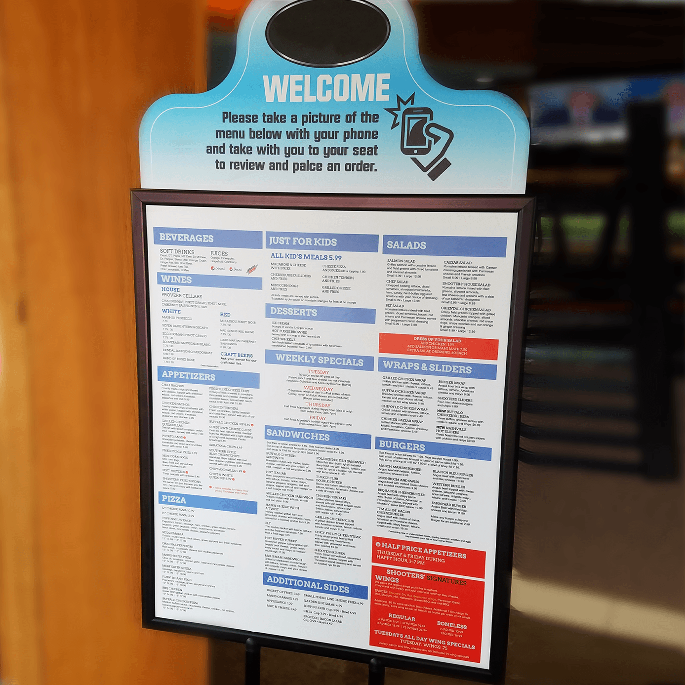
■ An uncluttered, easy-to-read menu board that groups like items is important
■ Indoor and outdoor menus should be very similar, if not identical
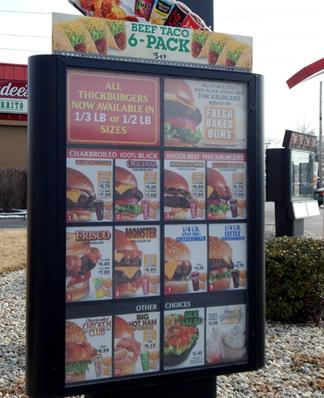
■ Outdoor boards don’t have as much space, or real estate, so keep it concise and easy-to-read
■ Big, bold, and highly appetizing food photography and a focus on pricing with minimal print is critical in helping customers navigate the menu and assists with faster decision-making
■ If a menu description is too long or complicated, consider putting it on the pre-sell board in the order line such as a poster or a yard sign or pole banner in the drive-thru. Another option is to add menu extenders signs for additional merchandising space.

Taco John’s, a Mexican fast-casual concept, launched a new menu board design that boosted sales for the chain restaurant by 12% increase in the sale of their EZ Combo meals. The new drive-thru menu boards featured two panels instead of three. Interior menu boards also got a makeover to help drive additional sales and make the ordering process easier for their guests.
We’re hopeful that some of these menu board design considerations will pay off for you!

